Experiments in
Automatic Music Font Conversion
The new
SMuFL standard (Standard Music Font Layout) introduced by Steinberg in 2013 and now part of the
W3C Music Notation Community Group promises interchangeability of music fonts in notation software.
A few SMuFL fonts are already available (see
Bravura,
November 2,
Gootville,
JazzyBasic,
MScore,
MuseJazz,
AloisenU,
Aloisen GrooveU and
Leipzig). Though most of them only contain the standard music symbols introduced with
Adobe's Sonata font in 1985 and not the full SMuFL range.
But what about the other
countless music fonts ? Will they ever be available in SMuFL ?
Will we finally get hundreds of fonts that work seamlessly in all notation programs ?
Probably not.
At least not if the conversion has to be done manually. It is an effort of several hours, probably even a few days.
And it is also a question of copyright. Even if there were enough volunteers for the conversion, they would probably not be allowed to reencode the fonts (at least in the EU, in the US it might fall under "Fair use"). As many fonts were designed in the 1990s it will be difficult to trace back the copyright holders, especially when these were companies that don't exist anymore.
For more information on the conversion to SMuFL, you might want to take a look at Robert Piéchaud's description of making his
November font SMuFL-compliant
on the Lilypond blog and on the
TENOR 2015 conference.
Suggestion for an Automatic Process
Unless the font conversion process becomes automated, the old fonts will probably not be available in SMuFL format.
To overcome this problem, here is our suggestion for a simple, but very effective process.
It automatically converts one font to any other font's metric and map requirements - including automatic creation of composite music symbols (e.g. "ppp" made from "p"+"p"+"p") and filling in missing symbols from fallback fonts.
The following screencam video demonstrates the prototype in real-time.
Within
only one minute we will get
a Maestro-compliant font from an arbitrary unicode font that didn't work in Finale at all.
The free
Euterpe font by Ben Laenen is used as an example.
The font conversion process starts at 0m:30s in the video.
 Video: 1-minute realtime conversion from Euterpe to EuterpeFIN
The conversion process works like this (see video above):
- The upcoming House Style Changer plugin for Finale holds a database of music symbols from more than 400 music fonts. It is used as the basis of the transformation process.
- The destination character map ("Maestro") and the source font ("Euterpe") are selected. A fallback font for missing symbols is set ("Bravura").
- The plugin calculates the necessary symbol processing commands in the FontForge script language and writes the script into a file ("Euterpe to Maestro font conversion.py" in the video).
- The plugin takes care of composite symbols and those that are not available in Euterpe,
E.g. dynamics (sfp=s+f+p), ♩=, ( ), 8va/8vb clefs, n-bar repeats, parenthesized accidentals or upsidedown grace notes.
These are automatically composed from existing symbols or taken from the fallback font Bravura - all expressed in FontForge script commands.
- If the destination font map still had empty symbol slots and the source font some symbols left, these slots were filled.
- The script is run in the free font editor FontForge.
- FontForge automatically creates the new merged font - symbol by symbol (1:03 in the video).
- The font can then be installed in the OS (1:41 in the video).
- Some adjustments in the notation program may be necessary (in Finale for example creating the font annotation file and adding the font to the MacSymbolFonts.txt.)
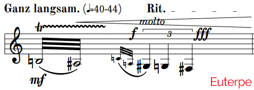
Image 1: Comparison of Maestro and EuterpeFIN after its conversion in the notation program Finale
The EuterpeFIN font from the video and other automatically converted fonts are
available in the download section below.
Automatic SMuFL Conversion
What makes an automatic font conversion to SMuFL more difficult is the metadata that needs to be created with each font.
The plugin and the font database have some solutions for that:
- glyph semantics are already stored in the font database (e.g. element name and element group)
- the plugin reads and works directly with the true type font files: it has access to their glyph data and knows all endpoints, so bounding box cut-outs could be calculated automatically.
- the glyphBBoxes structure is already calculated automatically by the plugin as this is necessary for Finale's fonts
- repeat offsets are supported as those were also required for the Maestro conversion
- dynamics with notehead/stem alignment ("optical center") is supported by a rough estimation which was developed for the
music font comparison
Another Example: Aruvarb
The
Aruvarb font was basically a Bravura font plus all necessary adaptions to make the font work in Finale.
Unfortunately Aruvarb was still a unicode font and not Maestro-compliant. So to use it in Finale a lot of document settings needed to be tweaked.
The
House Style Changer plugin could do this with one click, but without the plugin it would take hours.
So how about making the font Maestro- AND Bravura-compatible ?
That would be a lot of work if you did it manually: each symbol had to be repositioned and/or rescaled to match exactly the Maestro font positioning.
And what would happen if a new release of Bravura came out where some symbols where updated ?
Doing it all over again ? That's not really an option.
Let's take the process from above and let the plugin make a new Aruvarb font with an automatically created font conversion script.
The new Aruvarb font is also
available in the download section below.
To check the quality of the output we will compare the Aruvarb font in Finale with Fravura, a known Bravura port from
MuseGraph.
The Fravura font uses different font metrics than Bravura, but they don't match the original Maestro metrics either.
So a simple one-click replacement of the Finale default music font with Fravura should lead to slighlty misplaced symbols where as Aruvarb should match Maestro pretty good.
Why is metric correction of the glyphs so important ? For example when placing a "centered" dynamic expression, Finale doesn't take as reference the middle of the symbol, but the center between the origin and the advance width.
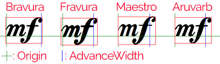
Image 2: Comparison of the "mf" metrics
If these areas don't match exactly, the symbol will look slightly shifted when replaced.

Image 3: Comparison of a "centered" placement in Finale and the resulting empty buffers on each side (blue)
The metric incompatibility is a disadvantage when replacing a font in an optimized document as the optimizations may disappear, but may be an advatage when creating a new music document from scratch.
The Fravura/Bravura dynamics have glyph settings that were optimized for centered positioning while
Maestro isn't optimized.
Centering dynamics is a known problem of many notation programs and/or music fonts and may require
sophisticated solutions.
We should always keep in mind that the automatically create font can never be fully congruent with the destination font. Still they have differently designed symbols! Especially the aspect ratio of symbols may vary a lot and the symbols were not rescaled to fit the destination font's symbol boundaries.
More on this can also be found in our post on
font metrics.
For the comparison we need to change the default Maestro font through
Document->Set Default Music Font to Aruvarb and Fravura, respectively.
Then we take a screenshot of the result and compare it mathematically and visually with the original Maestro document.
For the mathematical image congruency check the free image software
WildBit Viewer is used.
This is the result with some typical image comparison values:
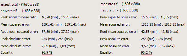
Image 4: Results of the image comparison
Aruvarb congruency with Maestro 96,9%, Fravura 96,2%
The image congruency between Maestro/Aruvarb is
0.7% higher than between Maestro/Fravura.
This may not sound not huge. But if you look at it the other way round, the difference is more obvious:
the number of non-congruent pixels in Maestro/Fravura (=3,8%) is 22% higher than in Maestro/Aruvarb (=3,1%).
The main reason for this is probably the different spacing and/or glyph boundaries used in accidentals and dynamics in Fravura compared to Maestro.
This result is confirmed visually. Here is a before/after animation of both font swaps. The Maestro/Aruvarb swap seems a bit smoother.

Image 5: Watch the difference between Maestro->Aruvarb->Maestro->Fravura
It can be viewed best if you focus on one spot during the animation.
Download the screenshots in full resolution: Maestro Aruvarb Fravura
(And yes, the "engage pedal" mark is accidentally missing in the screenshot above)
The major differences between Aruvarb and Fravura are:
- The dynamics in Fravura didn't use metric correction, so they appear slightly misplaced:

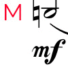
Image 6: a) Maestro/Aruvarb b) Maestro/Fravura
The mf on the Fravura font moves further,
the natural collides with the note and the Fravura typeface looks bolder.
- The dynamics in Fravura use a slightly bolder typeface than in Bravura (see also image 6 and image 2 above).
- Some flag symbols are missing in Fravura, so it's not fully Maestro-compliant (e.g. 144-147, 240, 251).
- The Aruvarb brackets (see staff 3 measure 1 beat 4) are rather bold compared to the original Maestro. Fravura uses less bold brackets that were probably not taken from Bravura.
- The 8th note flag seems to be scaled or transformed in Fravura. The original Bravura flag is slightly larger.
- Fravura uses some symbols that look different than the originals in Bravura (the breath mark comma, the staccato dot and the tempo indication ♩=)
- Some rather bold Bravura symbols were slightly reduced in fontsize for Aruvarb (e.g. the tenuto line was reduced to 90% of its original size).
- The accidentals in Fravura use different glyph boundaries and affect the spacing of the full document.
- Aruvarb includes all Bravura symbols (>3000), Fravura includes less than 200 symbols.
!!!! auch bei Kalle auf 10 PUnkte erhäönen)
- Aruvarb is based on Bravura v1.25, Fravura on a much earlier release of Bravura

Image 7a Maestro / Aruvarb:
The space between each of the two accidentals doesn't change.

Image 7b Maestro / Fravura:
The space between the naturals is decreased
and between the flats is slightly increased.
Difference between using the House Style Changer plugin in Finale and doing a simple font swap
Although it sounds attractive to swap the music font in Finale by just selecting a new default music font, there are still some major advantages in using the House Style Changer plugin.
For example:
- The plugin performs re-centering of articulations. Finale doesn't update centered articulations when swapping the default music font: you need to run 'Utilites->Change Notation->Articulations->Position all articulations' to fix that, but that may mess up manually positioned articulations.
- The plugin has a more advanced metric corrected placement function: it compensates for different symbol sizes.
- The plugin can also update any (!) document setting to better support the style of the new font (i.e. thicker staff lines, slur lines, hairpin lines, etc., different spacing, a new piano brace style, ...).
- The plugin can also update text fonts and individual sub-music fonts (like the clef font, key font, etc.).
- The plugin can also update percussion noteheads and automatically adjust its character mapping.
- The plugin also updates the other subfonts and their font sizes correctly.
- The plugin can update any occurence of the previous music font in the document. The font swap only updates those occurences that explicitly use the "default" font. I.e. it doesn't update the font, if is has the same font name, but is not marked as "default".
Is there a benefit to using a Maestro-compliant font like HayFIN over the original font (i.e. Haydn) with the House Style Changer plugin ?
Yes. While the plugin takes a few seconds for its calculations (or a minute on huge scores), the font swap happens immediately.
The new Maestro-compliant fonts even have
a few advantages over the original fonts:
- They include composite symbols if these were missing in the original font.

Image 8: New automatically created HayFIN symbols
8vb clef, Parenthesized accidentals, composite dynamics,
♩=, small digits and vertically corrected half rest.
- It is possible to use incomplete symbol sections in Finale without losing any symbols. For example, the Alternate Notation section in Finale requires 7 symbols (slash, diamond and repeat symbols). If the selected Alternate Notation font doesn't include all seven symbols, they will be missing in the document. The new Maestro-compliant font can have the missing symbols filled-in from the Bravura font, so all symbols will be available in Finale.
- All rest symbols are vertical aligned correctly. While Finale only supports vertical correction for 8th - 128th rest symbols, the new Maestro-compliant fonts also have correct brevis, whole, half and quarter rests. In this case the plugin can only use rests from alternative fonts that are fully compatible with Finale.

Image 9: Vertically incompatible rests in Finale
So how do I get the best result ?
Use a Maestro-compliant font AND apply the changes to your document through the
House Style Changer plugin.
Conclusion
An automation of the font conversion process is possible with the music symbol database from the House Style Changer plugin and the script language from FontForge.
Although the example fonts above
only convert to Finale's Maestro character map, any other destination map is also feasible, but more difficult for me to test as I mainly use Finale.
SMuFL conversion also requires information on the font metrics and semantics in its accompanying description files. This data could also be extracted automatically through an extended version of the plugin and the music font database which already holds the symbol data of more than 400 music fonts.
Download
Get the Elbsound Music Font Package (82 music fonts)
 Download font samples: sll symbols (PDF)
Download font samples: musical excerpt (PDF)
Download font samples: sll symbols (PDF)
Download font samples: musical excerpt (PDF)
The font package includes 21 GNU GPL and SIL OFL fonts in ttf and otf format made compatible with Finale's Maestro through the automatic conversion process described above.
These original fonts were used:
Bravura, Beethoven, Cadence, Emmentaler, Euterpe, FreeSerif, Gonville, Gootville, Gutenberg, LV-GoldenAge, Haydn, Improviso, JazzyBasic, LilyBoulez, Leipzig, LilyJazz, Musica, Noto Sans Symbols, Profondo, Paganini, Ross, Scorlatti, Sebastiano, Symbola, Unifont Upper.
Don't forget: all fonts were created automatically!
This means: no extra symbols were designed, if they were missing in the original font.
But many composite symbols (see
image 8 above), rotated symbols (like quarter note with stem down instead of stem up) or scaled symbols (like small digits or grace notes) were created automatically.
And the missing symbols were taken from the fonts Bravura (for the SIL OFL fonts), Musica and Symbola (for the GNU GPL fonts) to make the resulting font fully Maestro-compatible.
Acknowledgements
Thanks to the font designers for making these fonts and publishing them under a free license like SIL OFL or GNU GPL-FE.
Thanks to George Douros for making his "Musica" and "Symbola" font available for free use.
Thanks to
Musegraph for making the Fravura font.
Thanks to Lawrie Pardy for licensing his NWC fonts for Finale (not yet included, but will be in an upcoming release).
Thanks to Ben Laenen for letting me use his reserved font name "Euterpe" as a prefix.
Thanks to Zvonimir Nagy and Karl-Johan Ankarblom for testing some fonts.
If you have suggestions for more fonts to convert to Finale and have the rights to do so, or would like to initiate a conversion process for another notation program,
please let me know.
Jan Angermüller, October 2016


