Browse through the font images by using the Arrow-Up/Arrow-Down keys. Hold the mouse button down on the image to toggle to font B.
This page is not optimized for cellphones because their screens are so small, so quick browsing with up/down and A/B comparisons do not work on cellphones.
A comprehensive list of more than 1300 music fonts is available on this Elbsound webpage.
This website is only viewable in landscape mode.
Please turn your mobile device by 90 degrees or make your browser window wider.
Creating the Elbsound Music Font Comparison: from Layout Requirements to Fonts
The online music font comparison started as a spin-off of the upcoming Perfect Layout plugin for Finale from Elbsound.studio. The layout plugin had to meet three font relevant requirements for the plugin to work successfully:
For articulation and expression handling: knowledge of the meaning of every musical character used in the document (e.g. character 85 in the Maestro font is the fermata above symbol).
For collision removal: knowledge of all of the metric data for each glyph of all music fonts in use.
For fonts other than Maestro: knowledge of the character map of the used fonts.
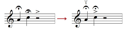
Image 2: Automatic articulation correction with knowledge of the semantics and metrics
Removing collisions of articulations was an important consideration for automation by the plugin: it was necessary to determine how two articulations should be positioned relative to each other: a fermata will go on top of an accent (Beat 2 above), but below a string bowing (Beat 1).
An articulation might be unnecessary or the result of a faulty copy & paste command: e.g. a fermata on a rest is allowed, while an accent on a rest should be removed (Beat 3).
The metric data for each font glyph was needed to properly calculate positioning without a collision.
Finally, if this was to work with every music font Finale compatible or not a character map for each font was necessary.
After having implemented the character tables of some standard music fonts and their metric functions, it became obvious that it would be possible to create an automatic “font swap” plugin using this database which improved on Finale’s own font conversion tool, as it took into account the character maps. One-click conversion from Maestro to SMuFl Bravura would be possible!
A prototype was finished quickly, but because the metric information was not used, some symbols appeared with inconsistencies in their positioning compared to the original font.
Nevertheless the result was so promising that we were eager to see the output with corrected placement of the objects. The foundation for the music font comparison was laid.
In the next months more than 300 fonts with 1500 different music and chord symbols were added to the database and the conversion functions for each object type in Finale were implemented.
During this phase more ideas for useful related plugin tools came up:
How about a tool to quickly change the House Style of a score which updates all Finale document settings in addition to the fonts in one pass? House Style Changer Plugin
How about a “Realbook” plugin that creates a sophisticated house style change using noteheads and accidentals from different handwritten fonts to achieve a more realistic handwritten look? Realbook Plugin
How about a chord changer that would also change the Finale chord library to any chord font? Chord Style Changer Plugin
But what would happen when the program had to decide what to do with an unknown font? Not every music font is implemented in the plugin and many will never be because of restricted availability or licensing issues. So a comprehensive music font list was required to help the program determine whether a missing font in the semantic database was a text font or a music font. That list became the 1000 Music Fonts List on Elbsound.studio.
What is metric correction ?
The main difference between the font conversion used in the online music font comparison and Finale’s own font tools is the metric correction. It tries to move every symbol to an optimal position, so that the difference between the original font and the new font is minimized.
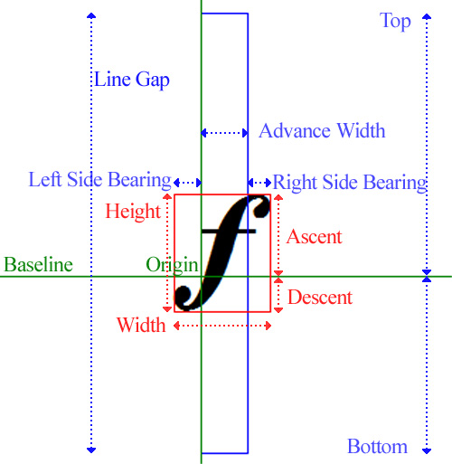
Every font glyph has a number of metric properties. A musical symbol in a font is typically defined by its width, height, line gap, top, bottom, left, right, baseline, origin, advance width, left side bearing, right side bearing, descent, ascent and font size, among other attributes:
Image 3: Metrics data from the Maestro forte symbol
Metric correction means that the symbols of the new font will be shifted and scaled so that they visually appear on the same position as the symbols of the replaced font. Because the symbols usually don’t have the identical size even after scaling some are broader, some are smaller they will never be placed at the identical (origin) position.
For instance, if the same symbol in two different fonts are not the same width, the two symbols needs to appear at slightly different horizontal placements to each appear centered. Adjusting for these differences, whether left justified or centered, should be straightforward.
The problem is: Finale doesn’t shift a symbol at its boundaries, but at its origin. The origin is where the tiny pink rectangle appears in Finale (also called an “anchor point”).
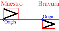
The position of the origin may be quite different depending on the font. For example Maestro’s accent has the origin at the bottom left corner, while one of Bravura’s accent symbols has the origin at the top left corner:
Image 4: Origin of an accent symbol in Maestro and Bravura
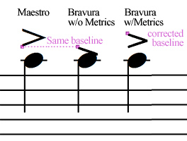
To make the font conversion look good in this case this difference of the origin has to be taken into account:
Image 5: Comparison of an accent conversion from Maestro to Bravura without and with metrics correction.
An additional technical consideration is that for horizontal justification Finale doesn’t calculate using the symbol’s width, but its “advance width” (i.e. the distance between vertical green and blue line in image 6).
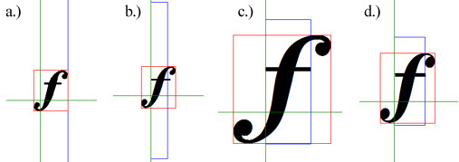
If you compare the forte symbols from different fonts in image 6, you can see how differently they can be stored in a font. And one can conclude: automatically calculating the optimal position for a centered dynamic expression for an unknown music font just by looking at the metrics from image 6 is impossible. It’s only possible to find an approximation that will work fine in most cases.
Image 6: Metrics of “forte” from MScore, Maestro, Turandot Text and Helsinki Text
The main differences between the characters above are:
huge line gaps in a/b, small line gaps in c/d
no right side bearing in a
large left side bearing in c (about 34% of the width), small LSB in a (20% of the width)
small descant in a (23% of height), large descant in d (31%)
huge basic font size in c, small in a
origin very close to the serif terminal dot in a, origin very close to the f stem in b
f crossbar ends before advance width in a, on advance width in c/d and after in b
Nearly quadratic boundary box in c (aspect ratio 1,11:1), rather rectangular in d (1,3:1)
After performing the automatic metrics correction the fonts look nearly congruent in Finale:
Image 7: Congruency after applying Metrics Correction
Additional considerations when updating a Finale document to a new font
Finale handles the placement and metrics calculation of each object type differently. Expressions, articulations, repeats, text blocks, smartshapes, noteheads modifictions, shapes, etc. need their own function or treatment for the metrics adjustment. Also the alignment and justification influences the new position of each object type.
Neither Finale’s plugin interface nor Finale’s font annotation files (FAN-files) give access to all metric parameters, so a font metrics reader is needed to analyze the fonts directly. By having access to the complete font metrics more information is accessible: instead of just looking at the boundary box of a character as Finale does with its FAN files in the Edit->Preferences->Font Annotation Dialog, it is possible to analyze the edges of the lines that a character is made of and thus program better collision removal. SMuFl has a similar concept called “bounding box cut-outs“.
What shall the automatic conversion tool do if a required symbol is missing in the requested font ? A group of several alternate fonts of the same style is needed to fill these gaps. The plugin uses a prioritized list of sub fonts for each font. Some font families already have their own sub fonts (e.g. the Sibelius sub fonts: Special, Special Extra, Text, etc.), while others require the support of a list of general helper fonts.
Fonts in Finale can behave differently in MacOS and Windows. Older fonts from the 1990s and early 2000s are not always 100% compatible with the current releases. On Windows especially the character slots 129-159 seem to be a problem. In Finale 2012-2014.5 Windows the symbols from 129-159 do not appear (e.g. SwingMusic, Vienna, Paris, Oslo, Virtuoso, Sebastian, Bach-antico).
Unicode implementation is already very advanced in Finale 2014/2014.5. Only very few areas like shape creation are not fully compatible yet. For example it is not possible to create an 8va violin clef with the Finale shape designer as a combination of the digit 8 with a violin clef from a font with an upper unicode structure (like the Lilypond fonts).
Finale / Windows has some issues within the font selection dialog of its international editions: when the font is selected with a non-standard weight (i.e. light, wide, medium, etc.) in the translated form (e.g. “Fein”, “Halbbreit”, “Mittel” in the German Finale), then Finale will not recognize it. For some fonts workarounds exist. For example instead of selecting “Maestro” with weight “Halbbreit” (German for “Wide”), simply type “Maestro Wide” as a font name. In other cases (for example “Scorlatti Mittel”) these workaround do not apply and selecting “Scorlatti Mittel” always delivers “Scorlatti Fett” (=Bold). Here it is only possible to select the correct font name with a plugin.
Typically music fonts use one of three different kinds of dynamic expressions that need to be made interchangeable:
– combined single characters (“mf”)
– a combination of characters (“m”+”f”)
– a combination of characters plus tracking (“m” + ExtraSpace + “f”).
To work with all three methods a plugin must be able to recognize sequences of letters including tracking information and transform them into an info like “Dynamic mf found. For longer sequences like “sfz” (sforzato) it must also detect alternative combinations with the same meaning like s+f+z (Opus Text font), s+fz (Mozart 8) or sf+z (Guido2).
In image 6 above (Metrics of “forte) example a (“MScore”) requires tracking in Finale for creating the sequence “ff” (Image 13 right). It has no right side bearing, a very short left side bearing and an origin that is further left than in the other fonts. Without tracking the two “f”s wouldn’t connect (Image 13 left). Unfortunately in most cases it’s not possible to calculate the best value for tracking, but it has to be found out individually by trial and error. It also depends on the letter combination: fp, ff, sf and mf may need a different tracking depending on the font.
Image 13: MScore’s “f” + “f without and with negative tracking
Finale has only few limitations regarding font compatibility. But some cases can be difficult to handle: digits, rests, flags, time signatures, alternate notation and percussion noteheads.
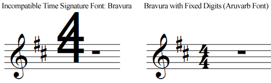
a) Digits used for time signatures must be in the standard ASCII character slots 48 to 57. If they are in different slots, like for example in SmuFl (Bravura), they are not available in Finale and the time signature will appear faulty:
Image 8: Finale-incompatible time signature font Bravura and fixed in Aruvarb
b) All rest symbols must be from one font, but the baseline can only be adjusted for 8th – 128th rests. So if the baseline of a quarter, half or whole rest doesn’t match Maestro’s baseline, then this font cannot be used (Image 9) unless the document doesn’t require quarter, half and whole rests. Or you have to change the “Default Placement” of rests in the “Staff Setup”. This allows an individual baseline adjustment at a step size of 12 EVPUs which is already sufficient for some fonts. But it must be modified for each staff individually – it’s not a document setting.
There is also a Maestro incompatibility with SMuFl where the whole rest baselines don’t match:
Image 9: Finale-incompatible half and whole rests in the Lilypond fonts. (shown: LV-GoldenAge)
c) Alternate notation symbols (i.e. slash/diamond symbols and one-/two bar repeats) are very often incomplete in a font. As all symbols must come from the same font in Finale, they will either be partially unavailable in these incomplete fonts or other fonts must be used as a substitute. Furthermore, the large slash doesn’t have baseline correction in Finale:
Image 10: Maestro on top with full alternate notation support, MTF-Ross on bottom only has a large slash symbol
d.) The abbreviated time signatures (common time / cut time) require the same baseline as the composite time signature “plus” sign. If they don’t match, then the plus sign will not be centered between the stafflines:
Image 11: “Plus” baseline doesn’t match common time baseline.
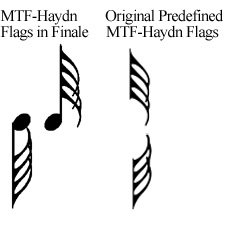
e.) Some notation programs use pre-composed symbols for each flag combination, i.e. one symbol for the 128th flag, one for the 64th flag, etc. Finale supports two other flag models: one flag symbol multipled for all flags (“Straight Flags”) or a combination of “First Flag”, “16th Note Flag” and additional “Second Flags” for 32nd notes (and higher). Finale doesn’t currently support pre-composed flags for 32nd notes (and higher) and the other notation programs very often don’t support flag “stacking” as Finale does. In these cases the flags do not look optimal in Finale (Image 12).
Image 12: Comparison of stacked flags in Finale and original pre-composed flags from the MTF-Haydn font.
f.) Percussion noteheads, i.e. noteheads on a staff with notation style “Percussion”, must come from one font. Unfortunately some font families split their noteheads into several sub fonts. For example the Fravura font (Finale port of Bravura) has the special percussion noteheads in a sub font called Fravura-Extra while the standard noteheads are in Fravura. So the percussion staff can either use the standard noteheads or the special noteheads – a combination is not possible. As a workaround the plugin can optionally use notehead modifications which change the fonts on an individual notehead base. But this is no solution for editing the score later on.
Error Checking the Database
With an average of about 180 symbols per font semantically categorized, the font symbol database now holds about 72,000 entries. Among the methods for error checking were again two interesting spin-offs:
1) An automatically generated PDF catalog that lists all available symbols to each semantic entry (Image 14). This catalog should make sure that no symbols were assigned to the wrong entry and that the metric functions were working – otherwise the symbols wouldn’t be horizontally and vertically aligned in the catalog.
Image 14: Excerpt from the symbols catalog (“Double Rectangle Fermata Bottom”)
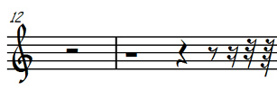
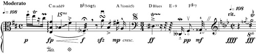
2) A few Finale test documents were created that included many different symbols on one page, so that it was easy to see which metrics or document settings were not updated correctly. This was basically the start of the “Music Font Comparison” as it appears online now. Test documents were automatically compiled for all fonts and could be compared in a PDF viewer or browser. “Example 4 (Mix)” from the online comparison is a short excerpt from one of these test documents (Image 15).
Image 15: An excerpt from a test document that found its way into the Music Font Comparison.
I hope you found this info on font integration in Finale helpful for your own font projects.
Jan Angermüller, July 2016
(The article originally appeared on Of Note-Blog.)
Annotations:
1.) The creation of the Music Font Comparison images and the implementation of all house styles was done fully automatically with a plugin. No manual adjustments were made afterwards.
2.) New in Music Font Comparison v2.0:
- more than 50 new fonts (including all 25 free Elbsound fonts)
- much better image quality due to a more complex process of image rendering at a low resolution
- direct linking to a selected font and example by adding "?font=FONTNAME&example=NUMBER" to the url,
e.g. elbsound.studio/music-font-comparison.php?font=neueweise (family)&example=4
- an additional contemporary notation example (Example 2)
- support of rotated noteheads (see Capriccio font)
- many minor improvements in the font substitution process
Thanks to Jef Chippewa from shirling & neueweise for kicking off the creation of a contemporary notation example and providing examples.
Thanks to Wess Karaatanassov for optimizing the layout of the musical examples.
Thanks to Chris for discussing many possibilites of improving the rendering quality of the images.
3.) When a music font didn't have the required symbol, a symbol from the same font family or from a similar font was used.
4.) Not all music fonts were used in the notation program they were originally designed for. In these cases some minor limitations in the layout may occur that currently can't be handled automatically (for example inconsistent distances between accidentals/key signatures, slighty vertically misplaced mid-measure clefs, faulty ledger lines, a weird offset of a trill line or a non-centered tremolo).
5.) Image artifacts have been reduced a lot in version 2.0 of the Music Font Comparison as a completely new image creation process was used:
the images are now much smoother, all flags connect correctly while the maximum sharpness of the stafflines is maintained.
In v1.0 the images were created with e-PDF to Image Converter and rendered directly in 120-150dpi.
v2.0 now renders the images at 800dpi with e-PDF to Image Converter. Then they are reduced to 140-180 dpi in IrfanView and finally a custom "Line Sharpener" tool is run on the output image to remove the blur from the staff and ledger lines.
The stems and barlines are still slightly blurry. I might update the sharpening tool to fix this in the next update.
The images are optimized for desktop monitors with more than 1200 pixels in width. On smartphones, tablets or reduced browser windows you might see a slightly reduced quality, because of automatic browser image scaling.
6.) An adaptive music spacing was used to have nearly the same position for each object and to provide a better music font comparison.
7.) The Alban Berg example is derived from page 3 of the 1920 edition of Berg's Vier Stücke für Klarinette und Klavier (see IMSLP)
8.) Example 5 is a nonsense score to demonstrate some more capabilities of the fonts (e.g. usage in chord symbols).
9.) Yes, the contemporary notation example doesn't make sense and even includes inconsistencies (for example the harp diagram doesn't match the scale). Well, just take it as an example of different notation elements ;-)
10.) More font links are available on the "1000 Music Fonts" list on the next page.
11.) A few companies with commerical fonts helped to make this Music Font Comparison by providing us with free versions:
Thanks a lot to DVM Productions for "KidNotes" and "Metronome", Werner Eickhoff for "Susato F3" and "Piu", Musegraph for "Stockholm" and "Oslo",
Wess Karaatanassov for "VintageGHMA" and "VintageECP1",
Shirling & Neueweise for "neueweise" font set, Monotype.com for "Varius Musika LT Std", Columbussoft for "Primus" and Obtiv e.K. for "Obtiva" and "ObtivJazz".
12.) There a still a few commercial font companies who have not yet offered to have their fonts here included for free.
If you want to have more fonts included (e.g. from Urtext, NorFonts, Ted Mook, Max Keenlyside's ragtime fonts, Educational Fontware, Virtual Conservatory, Colin Kahn, Presto Music Fonts, MusicTypeFoundry, Weelyrd Publishing, Cavatina or Jeff Levine), please make a donation, so that we can purchase the fonts and include them in the next release.
13.) If anyone wishes to include or remove their music font from this music font comparison, please send us a message.